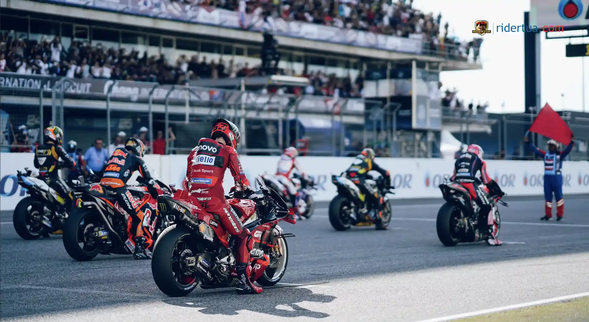
RiderTua.com – MotoGP’s new logo will change from 2025 although it is said that it will not please everyone, what is it?.. What is clear is that MotoGP will come with a new identity next year, including a ‘New Logo’… This new look is intended to be more expresses the championship’s core values and will culminate in a new logo.
Although MotoGP rights holder Dorna Sports has been working on this move since last year, teams in the premier class were already informed about it at this year’s pre-season test in February in Qatar. MotoGP’s new corporate identity has nothing to do with the takeover of 86 percent of Dorna’s shares by Formula 1 rights holder Liberty Media. The handover of the MotoGP logo, which will take effect from 2025, is planned to take place in November 2024. However, CCO Dorna and Rossomondo have discussed the process and explained the most important points of realigning the MotoGP brand at all levels. Regarding the logo, he announced that some will like it, some will not.
MotoGP Logo Will Change Starting in 2025

The MotoGP racing chief said that this update is about who they are and how they will present themselves.. MotoGP is an incredible spectacle that we witnessed in Austin. This is how MotoGP wants to present itself to the rest of the world. Their great luck is that MotoGP racing is extraordinary. They have to explain and show that, Rossomondo said.
According to Dorna’s CCO, MotoGP’s new identity is a global operation that covers many different areas. Starting with how they treat their fans, partners, and customers, they want to deliver a more unified message.
The result should combine the elements that most define the premier class of the Motorcycle World Championship. According to him, this sport is based on speed, innovative and technologically advanced. MotoGP riders are very brave and daring. If they can make sure the brand reflects that, then that would be perfect, Rossomondo said.
Meanwhile, for the new MotoGP logo, Dorna CCO tried to ignore its impact. But for the general public, this will be one of the most important changes. There would be a new logo, but to him that was the least interesting thing. What’s amazing is the strategy behind it. Some people like the logo, some don’t. They know that, concluded Rossomondo.


